Page 1 of 1
Tunica Resort by Kelciejammer [New Course]
Posted: October 6th, 2011, 8:07 pm
by BrianZ111
Course: Tunica Resort (7.1 MB)
Type: Fictional, Parkland
Designer: Kelciejammer
Date: 10/3/2011
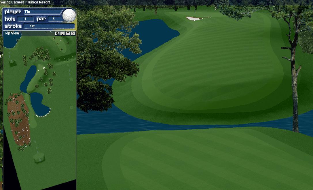
Images: #1,
#3
Libraries Used: august,
augusta2001,
beartooth,
flowers2,
flowers3,
houses1,
kingstonheath,
magallowaymountainver2,
northamerican
Re: Tunica Resort by Kelciejammer [New Course]
Posted: October 10th, 2011, 8:38 am
by hookster
Pretty darn nice for the 1st time K.J. Played much better after you added more trees. Enjoyed.
Re: Tunica Resort by Kelciejammer [New Course]
Posted: October 12th, 2011, 7:37 am
by spencerturner
Not a bad effort for a first try. You might want to pay a little more attention to your water features as none of them are flat. Water is suppose to be flat. Work with your flaten tool in Arch. You might also want to try to imporve you bunker lips as they are flat and should have some height to them .You have used an unplayable texture around your tees and some water features that looks like granite which is not a good choice. I dont think you would find this material on a real course. The flowers are a bit large in some areas and overall there seems to be a little too much eye candy in some areas. Looks better than my first course, lol . If you feel like you need help in some areas of design, dont hestitate to ask. Lots of folks here are willing and able to help . Spencer.
Re: Tunica Resort by Kelciejammer [New Course]
Posted: October 12th, 2011, 5:02 pm
by Kelciejammer

I do appreciate you looking at my course and I thank you for your observations on what I need to do the next time If I need some help I will be asking for sure. Thanks again, Kelcie
Re: Tunica Resort by Kelciejammer [New Course]
Posted: October 13th, 2011, 5:23 pm
by sandwedge
The things I liked about the course: some good hole concepts that might challenge the average cyber golfer, an attempt to bring some color into the course, putting trim around the tee boxes.
The things that need improvement: scale of objects, placement of objects, presentation of water, rock formations, and bunkers - I liked where they were put just feel they need more polish to look realistic.
The things I did not like about the course: I am not a huge fan of the color combinations, but this is a preference.
My rounds: Most enjoyable - think I would like to see that 17th hole polished and presented in a version 2 - it was a fun one for me!

Final thoughts: I give you a lot of credit for putting a course out there to be critiqued by the likes of me

Thanks so much!
Re: Tunica Resort by Kelciejammer [New Course]
Posted: October 16th, 2011, 6:28 am
by Polslad
As above.
Obvious first time release, with all of the common features of a new designer, all of which already mentioned.
My advice woulkd be:
Master the '2 shape' feature of the architect - gives you more realistic land shapes.
Work on object scale - some flowers and bunkers are way out of proportion.
Flatten your water hazards - one of the big bugbears for lots of players.
Try to create a 18 hole course, and not 18 individual holes.
Don't be tempted to use every object and texture available.
Don't try to create 18 signature holes on every design (how many real courses have this?)
Don't be put off by any of my comments - practise makes perfect, we all have to start somewhere.
Try to improve in some area with each release.
Welcome to the club.
Re: Tunica Resort by Kelciejammer [New Course]
Posted: November 17th, 2011, 5:05 pm
by Indy Anna Jones
Finally played this today and am adding my .02 worth; honestly I can't much more than what has already been said, except Poppy really likes it because he aced #6 today. I hit the flagpole in the air, but as a clicker I was 1 little line too strong.
Other than a couple of greens that were a little too domed I thought you did a very good job here.
The traps were nicely situated to catch the errant drive and were situated so that they catching both tru-swingers and clickers. Sometimes one tends to forget the other depending on his/her way of playing.
There were a nice variety of shots; forced layups on a couple of holes, doglegs that could be overrun and as I mentioned, traps situated well. The water has been mentioned already. As this is your first course, I'll be nice about some of the shaping and planting problems, but I would like to mention what we thought were design problems on 2 different holes.
#4, par 5, double-dogleg right. In the drive-landing area there is a trap left. If you avoid the trap you have 3 large trees on the right blocking the shot toward the green and near-green landing area. You're pretty much forced to make a layup further up the fairway and are stripped of the option to go for the green or near approach. I'm definitely not adverse to strategically placed trees (actually I love them) but except for a tiny gap your choices are removed. I'd have used 2 trees spread a little further apart to give the player a better chance on finding the gap.
#18, par 4, 297 yards. I love the layout, I like the planting except that the 2 large trees block any chance of going for the green (as mentioned by another poster, the scale is a bit large for the flowers but they're still pretty.) Again, this removes a player option, which is something a designer should try not to do or to minimize.
Overall, this a nice course and a very good newbie effort. As Polslad said, please don't be discouraged by other player/designer critiques; we all started somewhere. Practice with some of the tools and again as Polslad said, try to build an 18 hole course, not a course with 18 individual holes. And please, never hesitate to post your work on the Design board and ask for help when needed; we all love the new courses.